Before and after of a scenic shot. Location: Snuff Mill Field.
I like the strong emphasis of colours in this original photo which is what inspired me to manipulate the colour in order to blend it .
*I like this photo because it reflects the location where some of the music video was shot and contains bright colours* - Amy Black
I added a pink tint to the colour and cropped the image to fit the shape of the middle of the CD cover.
The changing of the colour enables it to stick to the recurring theme of a pink house style of the album digipak.
*I like the use of the pink that has been added to the image as it goes well with the rest of the album cover and looks emotive* - Amy Black
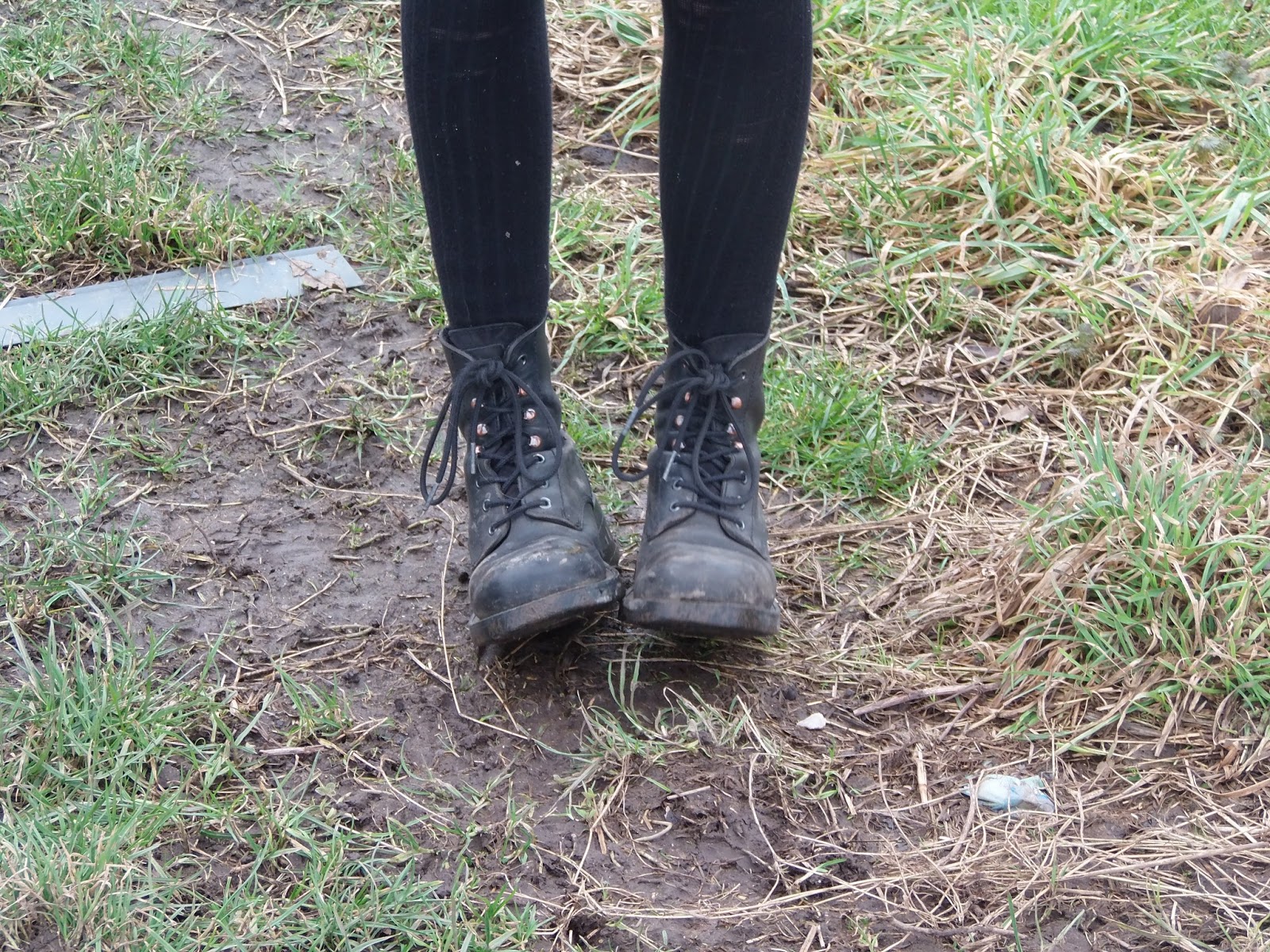
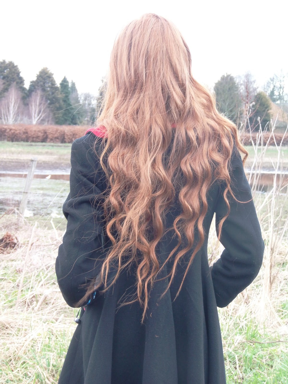
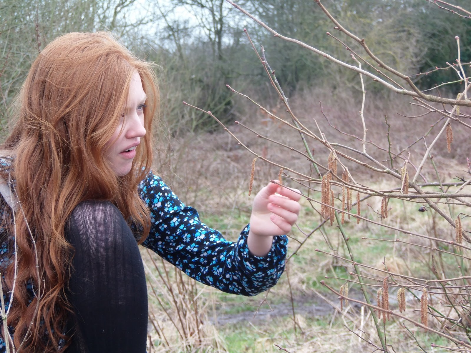
This is the original image of my artist, Sofie [Scholten]. Location: Snuff Mill Field
The pose with the graffiti on the bar shows an edgy girl though the slumped pose suggests the girl is in transition from sadness to happiness. Similar to the message in the music video
*The artist looks like this [hair and setting] in the music video so it's appropriate for this to feature in the album artwork* - Wez Foster
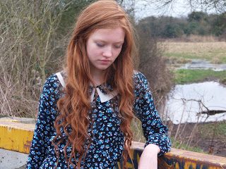
I have manipulated the image similar to the scenic shot where I have added a pink emphasis to the image. This is the image that would appear on the inside of the cover which matches that of the scenic shot.
The pink also includes a girly sense therefore appeals to its target audience.
I have also blurred the background slightly to ensure that my artist stands out.
*The pink makes this consistent with the theme and features the artist - important for an indie genre. I also enjoy looking at this image as it is well photographed* - Wez Foster

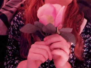
This is my original image of the image that is on my back cover. Location: My house - bed. Prop: Rose
I understand that this image has been taken in low lighting conditions because during this shoot I was reliant on fairy lights for my lighting to create a magical effect.
I have placed a rose in the shot which links to the house style colour choice (pink) and represents the girly essence I like to include.
*Although the image doesn't include the artist the focus on the rose is an effective technique as you do not want to include the artist too much* - Melissa Ford
I have brightened this image to make the details of what is in the frame clearly visible and again, added the same pink tint.
On the actual back cover with the track listing on I have added a blur which washes the background out. This makes the track listings stand out.
*I love this photo on the back including the track listings. It looks really right and like a professional back cover* - Melissa Ford

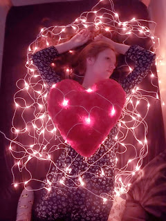
The original image of Sofie. Location: My house - bed. Props: heart shaped pillow and fairy lights.
I am proud of my idea of including the fairy lights in my photo although I know the original image suffers because of the low lighting but I was hopeful to edit it correctly to make it appear nicer.
*What you have done is clever, including the pillow and fairy lights in such a way that it looks magical. It resembles the original artwork for the album your chosen song is from which I think is effective* - Daniel Mail
I increased the brightness of this image to make sure that the image is visible. Again, I kept with the consistency and emphasised the pink to the image.
In the final front cover makes this image cropped as well as the artist's name and the album name.
*I really like this. It is very stylish and stands out. I can understand why this would appeal to girls because of the pink hue* - Daniel Mail.